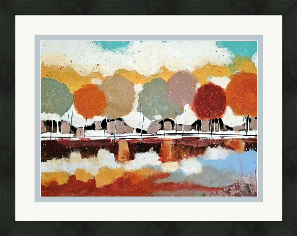
"His muted colors and distinct choice of subject matter have attracted collectors throughout the nation."
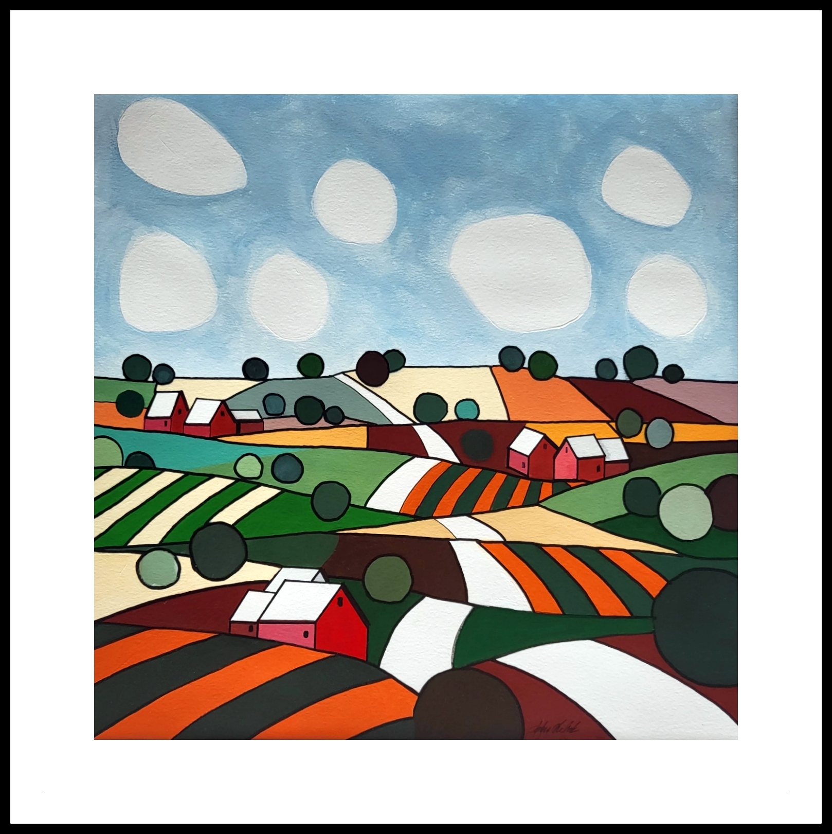
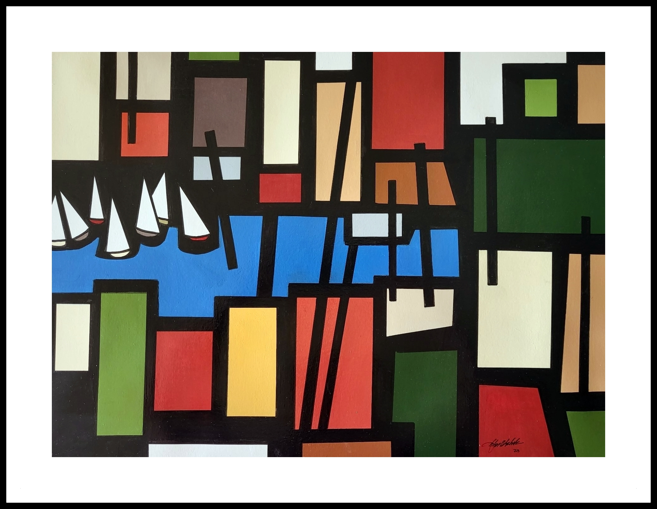
"John Chehak's style is a dynamic blend of colors, shapes, and themes that reflect his artistic journey and personal experiences."
What Other Online Reviewers Say:
Expressive Palette: Instead of overwhelming the viewer with color, you select a focused palette (warm ochres, cool blues, and neutrals) that enhances the mood. This restraint makes each color choice feel intentional and impactful.
Repetition with Variation: The repeated windows and roof lines create a visual beat, but you introduce subtle shifts in size, color, and alignment. This keeps the eye moving and prevents monotony, giving the piece a dynamic, almost musical quality.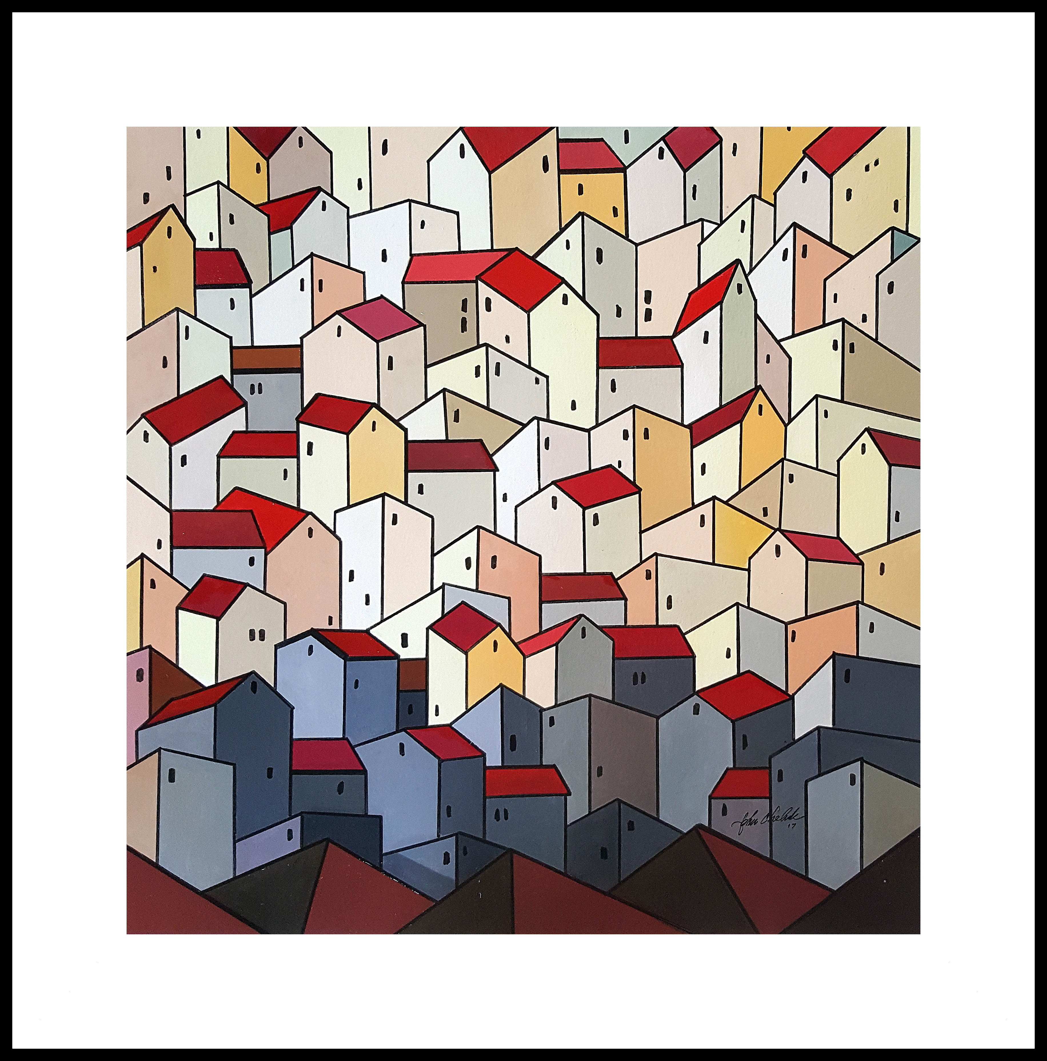 Architectural Abstraction: You distill the complexity of urban architecture into essential shapes—rectangles, triangles, and lines—creating a cityscape that feels both structured and imaginative. This approach strips away clutter, focusing the viewer on the underlying rhythm of the built environment.
The style is modern and abstract; it never feels distant. The warmth of your color choices and the familiarity of the subject matter invite viewers to find their own stories within the scene.
The spaces between buildings and windows aren’t just empty; they’re active parts of the composition. You use negative space to create breathing room, which gives the piece a sense of balance and clarity.
What Patrons and Public Viewers Say:
"I really love this! The colors caught my eye right away
Then the design held me." DB
“Congratulations on your huge sales, John!
We enjoy your painting so much.” JW
“We love your work.” BV
“Your colors are fantastic,” BG
“Wow! That’s awesome,” JD
“What a beautifully done painting,” MK
“Stunning” LP
“…You are so talented, and we value the
little drawing you did of us years ago!!!
Keep up the good work, John.” BV
“Awesome, we love all of them,” MB
“Your work is really great!” HR